

Kyu
Une identité digitale moderne pour un cabinet de conseil visionnaire
Kyu
Secteurs
RSE & Conseil
Banque & Finance
Expertises
Sous-expertises
- Identité graphique
- Vidéo et motion design
- Architecture de l'information
- Webdesign
- Maintenance site web
- Site web sur-mesure
- Optimisation éco-conception
Équipe
Une refonte globale pour se démarquer de la concurrence
Un site plus clair, plus lisible, et plus esthétique, voici ce que le client avait en tête quand il a décidé de faire appel à l’Agence. La création d’une nouvelle charte graphique et la redéfinition des offres a permis de créer un site à l’image de Kyu : expert et humain. 148 Agence Collective a relevé plusieurs challenges, et notamment celui de donner vie à la nouvelle identité visuelle du client.
"148 Agence Collective a proposé une offre globale au client allant de l’atelier au shooting photo en passant par l’identité visuelle et éditoriale. Chaque élément nous aidait à avancer sur les autres. Le tout a permis de fournir un rendu cohérent de bout en bout."
Pauline, Cheffe de projet, 148 Agence Collective
Un atelier dédié pour mettre en avant les expertises
Avec la refonte du site, le client souhaitait clarifier ses offres, tant pour ses équipes que pour ses clients, et les rendre plus attractives. L’agence a proposé un atelier créatif dédié dans les locaux de Kyu. L’objectif était d’échanger avec le client sur sa vision du métier et de comprendre ses différentes expertises pour ensuite pouvoir les retranscrire dans l’arborescence. La charte graphique, la charte éditoriale et cet atelier ont été les trois piliers de la construction de l’univers de la marque.
"Les ateliers sont des moments d’échanges et de clarification, pour nous, mais aussi pour Kyu. Une fois que nous sommes certains d’être alignés, faire avancer le projet devient beaucoup plus simple !"
Pauline, Cheffe de projet, 148 Agence Collective
Une identité visuelle modernisée
Le client souhaitait rafraîchir l’ensemble de son identité visuelle. L’agence a pris en charge la refonte du logo, la création de la charte graphique et également la papeterie (cartes de visite, en-têtes…). Aussi, la charte devait être facilement déclinable sur des supports print et digitaux. Le client voulait garder l’esprit du carré et des couleurs marines qu’il avait déjà dans son ADN. Le bleu marine et le vert ont été modernisés. L’idée était de donner plus de contraste, de la lumière et de redynamiser le logo et les couleurs du client. Coup de poker, l’agence propose une teinte framboise pour apporter du contraste et du peps. Le client valide ! Le logo reprend le précieux carré qui fait l’identité de Kyu, mais cette fois-ci avec plus de profondeur. La double couleur du carré apporte du relief et rappelle les multi-expertises du cabinet. Pour renforcer les lignes géométriques du logo, la typographie du logo a été créée sur-mesure. Le défi suivant était de taille : adapter cette charte graphique statique sur un site web dynamique.
"Réaliser une identité visuelle est toujours un challenge. Nous avons travaillé en co-création avec le client pour trouver les couleurs et la typographie qui lui correspondaient vraiment."
Hélène, directrice artistique, 148 Agence Collective
Un site immersif et performant
L’équipe créative a travaillé avec des blocs prédéfinis. Ce système a un gros avantage : il nécessite moins de développement et fournit un site plus léger et donc plus performant. Mais attention, plus simple ne veut pas dire ennuyeux. En arrivant sur le site, les internautes entrent directement dans l’univers de Kyu grâce à ce qu’on appelle un « loader », une page statique qui met en avant l’identité de la marque. L’internaute découvre en un coup d’œil le logo de Kyu, le bleu foncé de sa charte et une phrase descriptive sur son cœur de métier. Pas de doute, nous sommes bien arrivés dans l’univers Kyu. Les images de cover sont toutes coupées en bas à droite, rappelant le carré du logo, scindé en deux parties dans le sens de la diagonale. Le rendu se veut interactif, immersif et esthétique. L’internaute continue sa navigation et découvre les expertises tout en s’immergeant dans l’univers de la marque grâce à des carrés dynamiques et des animations en hover sur les boutons. Ces micro-interactions sont pensées pour rester légères et pour ne pas nuire aux performances du site. Même si ce n’est pas une volonté du client au départ, l’Agence garde toujours le réflexe de créer des sites créatifs légers, en suivant sa démarche d’éco-conception. À ce stade, il ne manquait plus qu’une chose… De belles illustrations pour ce site !
"Parce que la reconnaissance d’une marque va bien au-delà des supports, nous avons créé un écosystème graphique qui s’adapte tout autant à l’identité visuelle print qu’au site internet de Kyu."
Léo, directeur artistique, 148 Agence Collective
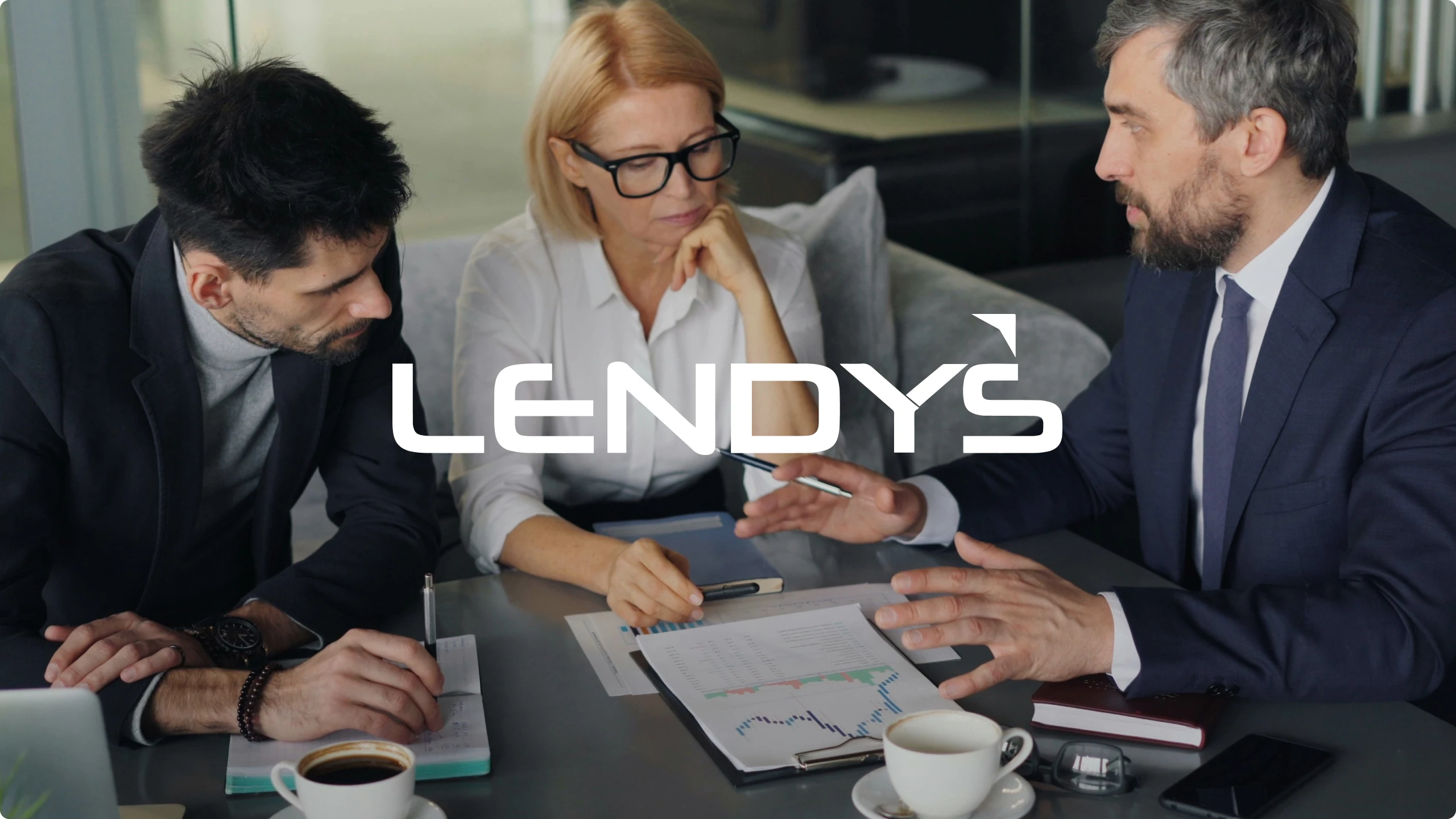
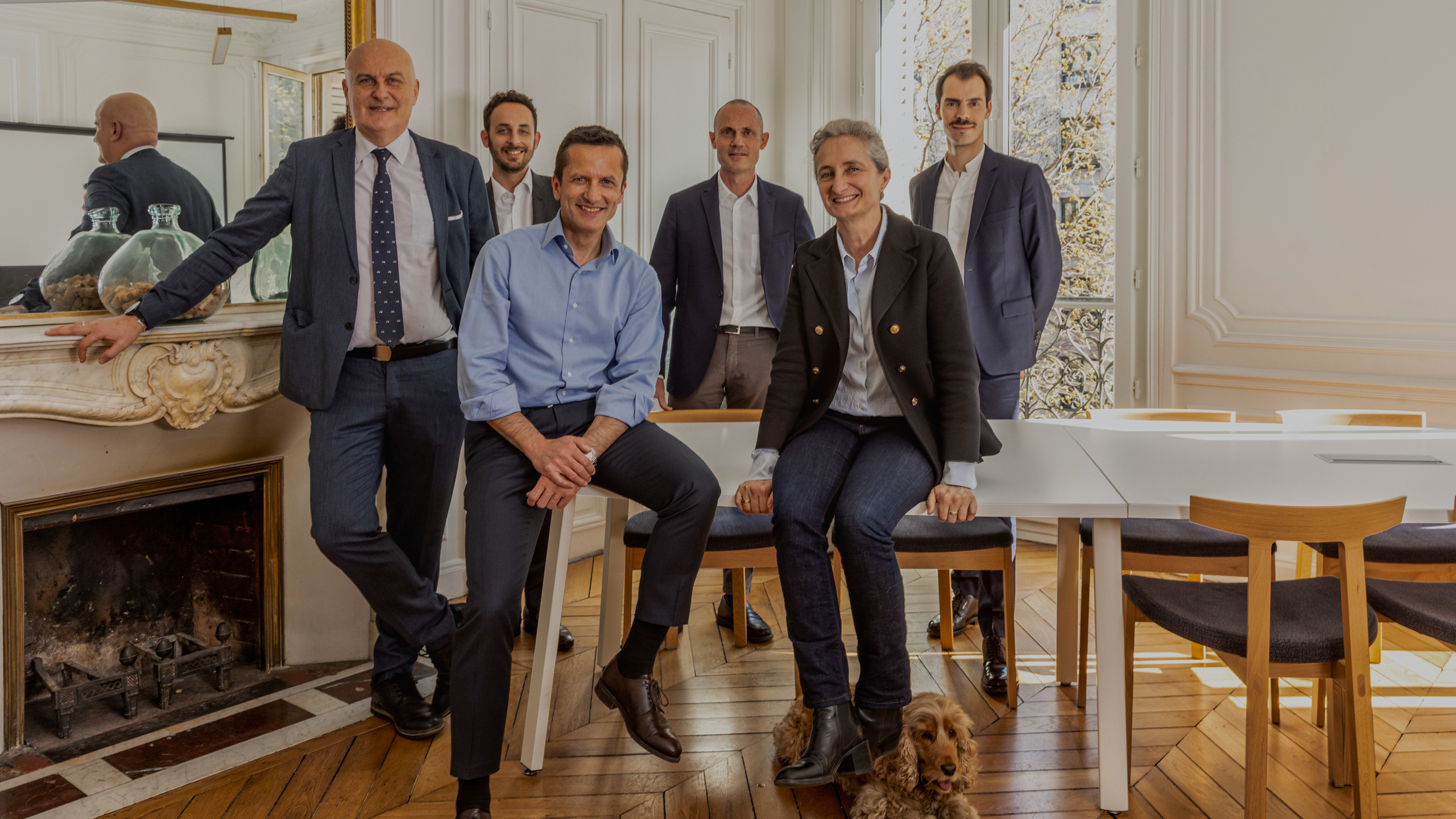
Un shooting photo personnalisé qui humanise
Kyu souhaitait renforcer la proximité avec ses clients et mettre en avant les experts de son cabinet. L’équipe créative est venue photographier les locaux et les collaborateurs « en situation ». Les prises de vues sont volontairement lumineuses, set dans l’ensemble, les collaborateurs adoptent une attitude plus décontractée que celle définie par les codes de leur secteur. Le client souhaitait rompre avec cette image trop froide et stricte sans pour autant perdre en sérieux vis-à-vis de ses clients. Le shooting s’est déroulé à la fin du projet pour coller à 100% avec l’identité visuelle et éditoriale définie par 148. Les photos ont pu ainsi être rapidement intégrées sur le nouveau site.


Contactez-nous
Avec nous, votre projet va devenir une réalité !
L’Agence Collective rassemble de nombreux talents
qui peuvent répondre à des projets de communication stratégiques et/ou opérationnels, ciblés ou multi-canaux, court et long termes. N’hésitez pas à prendre rendez-vous avec nous pour échanger et recevoir un devis sur votre projet !