Moonlight Editorial
Brand identity and website creation
When the “French Touch” hits the mark
Moonlight Editorial is an American content studio that develops impactful digital publishing programs for all types of businesses. When Mallory reached out to 148, she had already developed her business idea and was now looking to give it a face and a showcase. The result? A perfect example of a Franco-American collaboration: Moonlight Editorial’s brand identity and website embody everything we love at 148 Agency—a lovely design, a punchy website, and a friendly partnership !
More infos
I was looking for a truly creative agency, and I knew Lisa, their Creative Director, through mutual connections. When I saw 148 Agency’s work, I thought: “I want the same for Moonlight.”
Mallory Farrougia, Founder of Moonlight Editorial
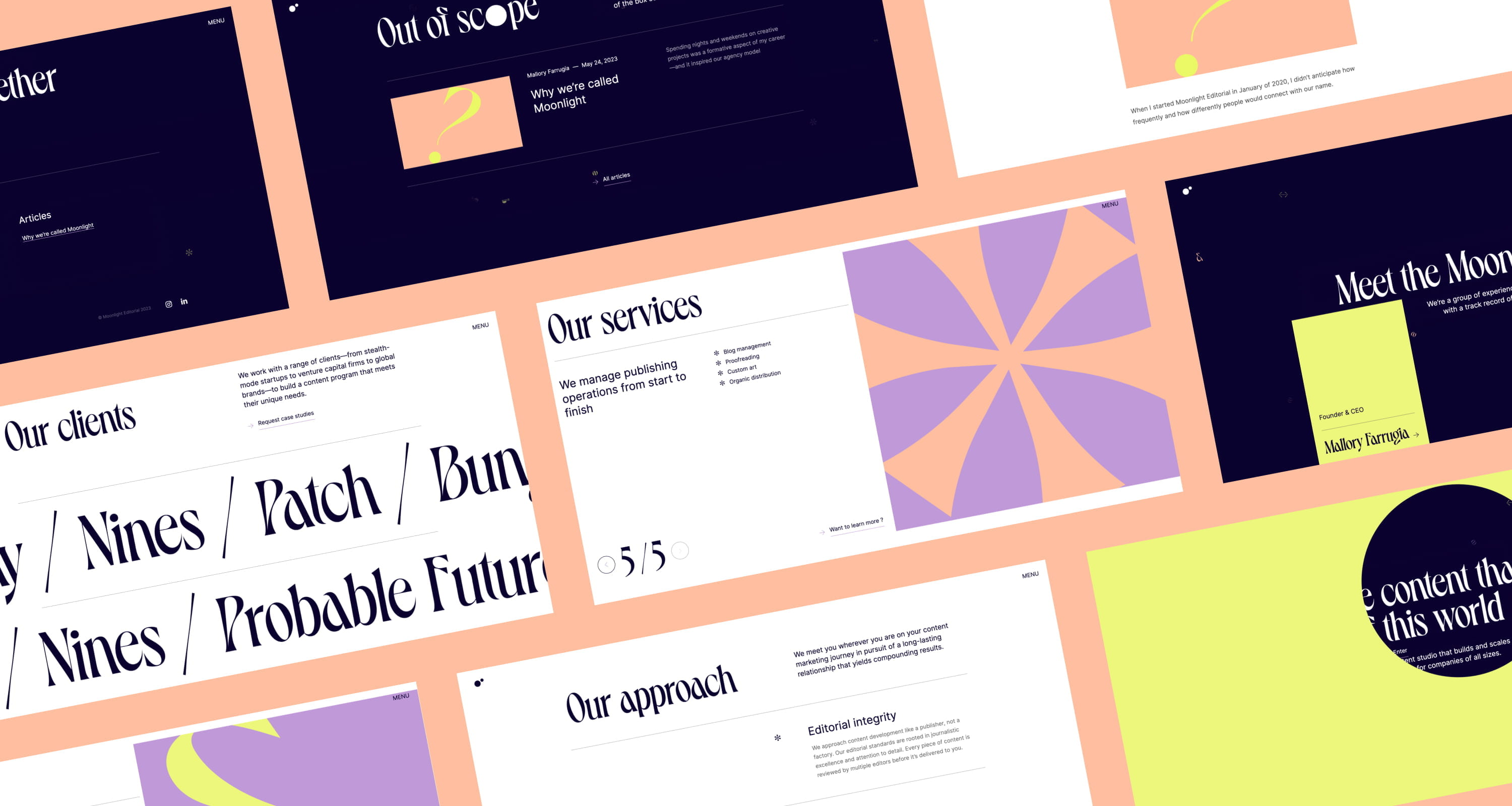
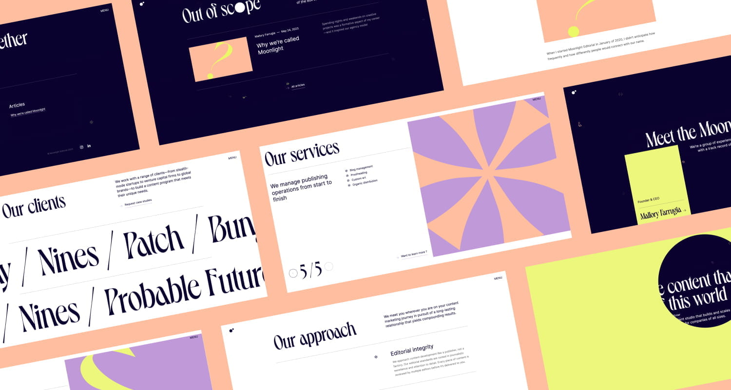
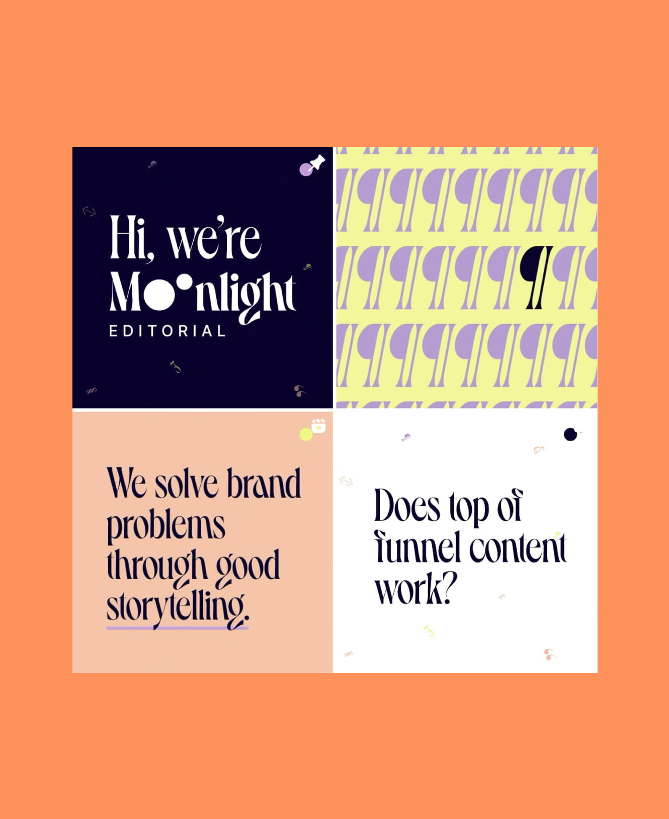
An identity built on illustration and typography
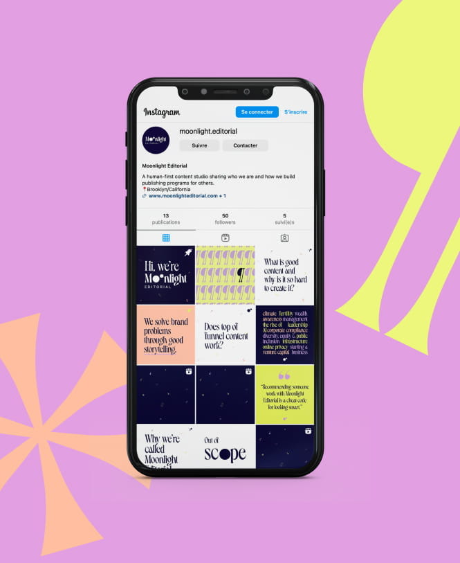
How do you bring to life a studio whose craft revolves around words? With typography, of course! We selected Dahlia from the Parisian foundry VJ-Type—a typeface with bold character, incredible presence, and a certain romantic flair... not to mention that charming Art Deco European touch. We balanced this historical trait with an identity featuring geometric shapes in vibrant, flat colors—vector-based and very digital.
This combination works seamlessly for the website and social media, but it's also flexible enough to adapt to stationary if needed—one of Moonlight’s requests, as they wanted the ability to produce their materials without needing an agency for every single post.
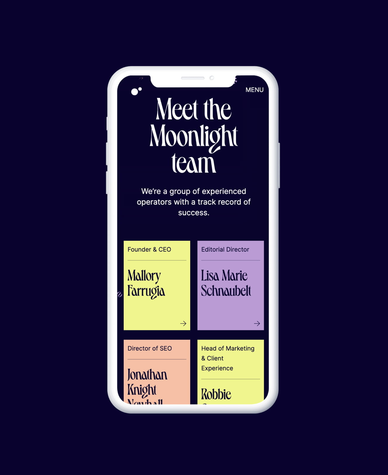
The website: an immersive brand universe
For the website, we chose to build on Webflow, a no-code platform that also handles hosting. This decision was driven by several factors: budget, the all-in-one nature of Webflow with hosting included, minimal maintenance, and the internal resource efficiency of no-code—a lighter project brief, with real-time development allowing for quick feedback loops.
The time saved on development gave Michaël the freedom to focus on animations: a spotlight effect on the homepage that follows the cursor to reveal parts of the text below, a vertical accordion menu, parallax, and swipe effects for the contact sections… Each part of the site has its own unique touch, letting users directly experience the impact that Moonlight Editorial promises.
Given the budget and the limited technical requirements from Moonlight, we chose to develop the site on Webflow. This allowed us to benefit from the speed of no-code for the structure while taking the time to create really cool animations that make the site highly immersive.
Michael, Full Stack Developer at 148 Agency


This project showcased our team’s ability to adapt to the tight budget and timeline of a startup while delivering work we’re proud of and that meets our client’s needs. Beyond the technical choices, it was the strong coordination and open dialogue between Moonlight and the Agency that allowed us to move quickly and prove that, if you’re aiming for the moon, we can get there together !



Have an idea ? Want to talk about it ?
It's even better !
Contact us


